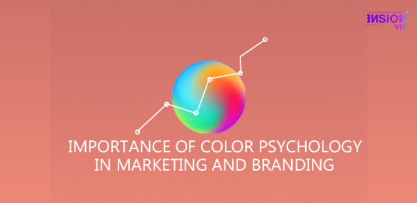
The Importance of Colour Psychology in Marketing and Branding
When it comes to marketing and branding, colour psychology is extremely important.
Colours influence how a customer perceives a company’s personality and expression, thus they’re crucial and should be aware of the colours that best represent your company in order to generate the finest initial impression.
Let’s take a closer look at colour psychology and how it may be applied to marketing and branding.
What Is Colour Psychology and How Does It Work?
The study of how colours influence human emotions and behavior is known as colour psychology. Whether you’re launching a new business, working on a rebranding effort, or generating marketing assets, your customers’ impressions of your brand will be influenced by colour psychology.
Many people feel that colours can stimulate distinct emotions that are tied to memories of those colours from our past. Many people, for example, who have swum in the ocean, find it pleasant, hence blue is often associated with feelings of peace and stability. We also get a sense of warmth and calm when we stare at the yellow sun.
What Is the Relationship Between Colour Psychology and Marketing and Branding?
A successful marketing effort will establish a bond between your brand and the customer. This can help to increase brand recognition and loyalty. This knowledge is valuable to you as a company, and you should make sure you have a colour plan in place to connect with your target audience and encourage them to connect with your brand.
Understanding colour psychology and selecting the appropriate colours for your business will help you grow your audience and increase conversions.
Colours Can Assist You in Creating a Memorable Brand.
When it comes to branding, colour is a powerful weapon. Consumers can recognize a brand simply by looking at its logo.
When you see Coca-red Cola’s hue, for example, you will quickly recognize the brand because it is a consistent colour. When you see the M from McDonald’s, you’ll immediately recognize it as the cheery, family-friendly restaurant.
Colours Can Help You Increase Conversions.
Did you know that colours may influence how your audience reacts?
Have you ever noticed that when a red light appears, you stop and when a green light appears, you proceed? The human brain is wired to respond to colour.
You may entice your viewers to become customers by carefully selecting the proper colours. Let’s have a look at the various hues and what they symbolize.
Red
In all senses of the word, red evokes ferocity. What brands spring to mind when you think about the colour red? Red is used in the logos of Coca-Cola, CNN, Nintendo, and Lego.
Orange
Orange is associated with creativity, adventure, passion, success, and balance, and it is frequently used as a call to action, depending on the emotions you want your customers to experience when they see it. Orange is used in the logos of companies such as Firefox, easyJet Airlines, and Penguin Random House.
Yellow
Sunshine is frequently linked with the colour yellow. When you think of sunshine on a sunny day with a clear blue sky, you think of joy, optimism, youth, and summer. Based on the content, tone, and shade of the hue, it can also be interpreted as a warning or dishonest. I’m sure you can think of at least one company that utilizes the colour yellow. Yup! McDonald’s is the one. Other examples are Best Buy and Nikon.
Pink
Pink is a colour that conjures up images of femininity, fun, and unconditional love. It’s easy to see why it’s frequently used for Valentine’s Day specials, wedding invites, and anything else that caters to a female audience. Victoria’s Secret’s named one of its brands Pink. Barbie also utilizes a lot of pinks.
Green
When you think of green, the first thing that springs to mind is probably trees and possibly money, so it’s no surprise that it’s associated with nature, fertility, eternity, health, riches, and generosity. John Deere, Whole Foods, and Perrier are among the companies that employ them.
Blue
When it comes to brand marketing, blue is a really potent colour. Trust, harmony, stability, quiet, and tranquility are all connected with it. On the other hand, it can also signify despair and coldness. Brands that offer winter clothing will most likely gain from the fact that it is chilly. In addition, industries that specialize in psychiatry can certainly use blue to signify depression and the fact that they deal with people who suffer from it. Facebook, Visa, PayPal, American Express, Intel, and Dell are among the companies that use blue.
Purple
Royalty, power, nobility, elegance, knowledge, and spirituality are all associated with the colour purple. As a result, if you misuse it for your brand, it may come out as arrogant. This hue is commonly used by brands to make their offers appear more respectable.
White
White is commonly associated with innocence, goodness, cleanliness, and humility, yet it can also have negative connotations in various regions of the world. White is also commonly utilized to enhance areas since it makes them appear larger. White is the most used in e-commerce websites.
Black
The colour black conjures up images of mystery, power, elegance, and refinement. It’s the most popular hue in retail since it represents all of the characteristics that most retailers want to be identified with. That is why the president and other high-ranking government officials are chauffeured in black limousines. Black, like white, is a neutral colour that has a powerful effect on spaces. Depending on how it’s used, black can evoke feelings of grief and rage.
Nike, Hugo Boss, Ralph Lauren, and Jack Daniels are among the brands that employ black in their logos.
Brown
Brown conjures up images of dirt, wood, and stone in most people’s minds. It’s a highly nature-oriented colour, just like green. It also represents safety and comfort. If you’re in the real estate business, it’s a nice colour to use because it conjures up images of homes. It’s also commonly used by companies that sell natural and organic products and foods.
Are you prepared to elevate your company’s image to new heights?
Colours have an impact on how a customer perceives your brand’s personality and expression, so you want to make the best first impression possible.
Our team at Dimension VIZ focuses on brand creation and marketing. We are well aware of the significance of colour psychology and how it is represented in marketing and branding. Colour theory is one of the most significant aspects we consider as an agency while working on any branding project.